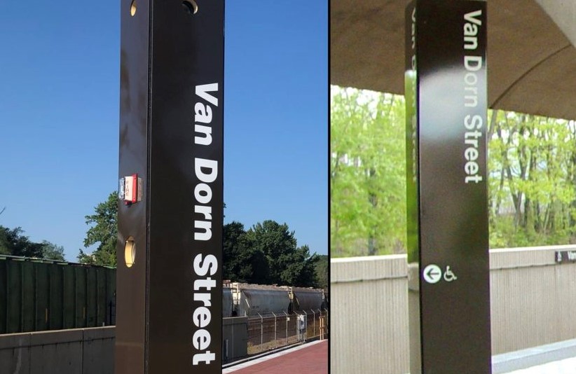
Six Metro stations south of Reagan National Airport have been closed all summer. As of this morning, they are reopened with new lights, new platforms, and ... new fonts?
The vendor in charge of the new Metro station signage will be fixing it, but until then, riders are on both sides of the fence with this issue. For most people, this isn't a big deal. In this area, though, with plenty of eagle-eyed riders mentally editing the new signage, the incorrect fonts are a bit annoying.
I'm prepared to raise hell over any number of #wmata things, but the font issue bothers me in a really stupidly visceral way. I DEMAND better font choice oversight! @JWPascale
— Andrew Kierig (@kierig) September 9, 2019
I know there is no way I would be able to read the sign in anything other than the WMATA approved font weight.
— James Hare (@jamesjhare) August 9, 2019
Three faregates blocked off and only one side of the platform is useable at Springfield. I can see why Wiedefeld did his press avails at Braddock. Oh and the font is still wrong. #wmata
— TKBlueline (@tkblueline) September 9, 2019
As you can see in these tweets, the new lettering is a bit too thick and cheerful, IMHO.
#wrongfontweight #wmata pic.twitter.com/8pfO22BQRL
— Byron Peebles (@bpeebles) September 9, 2019
Big wigs & new bags #wmata pic.twitter.com/y8UAZ5wYJ5
— JenniferFolsom (@jenniferfolsom) September 9, 2019
Six #wmata Blue & Yellow line stations in Northern VA such as Braddock Road reopened today after a summer-long project to conduct platform & other improvements. @WashInformer pic.twitter.com/hKjl8PIMDz
— William J. Ford (@jabariwill) September 9, 2019
Ah well... it could be worse!
What do you think about the font issue on the new Metro signage? Is it cringe-worthy enough to affect your commute or just another quirk of the WMATA landscape? Sound off in the comments!
